Hoa Mai preschool Site Redesign

How might we build a website that embodies Hoa Mai's dedication to serving the community, preserving cultural heritage, and creating a positive and affirming online experience for all?

context

Overview

The Hoa Mai Bilingual Preschool is the first Vietnamese-English dual-language child development center in the Northwest. Nested in South Seattle, Hoa Mai is at the core of the Vietnamese community and is a considerable influence in helping young kids learn Vietnamese tradition and culture.

Hoa Mai website redesign project view

Project Type

UX Design
Client Sponsored

My Role

Lead UX Designer
User Researcher

Team

Class Project
Team of 4

Duration

10 Weeks
Spet 2022 - Nov 2022

context

The Problem

In recent years, Hoa Mai has faced challenges due to the pandemic, safety concerns in the neighborhood, and resource constraints. Their website, managed by the Executive Director overseeing multiple programs, has taken a backseat in terms of priorities and has been neglected due to time, budget, and expertise limitations.

Initial discovery

Understand the Client

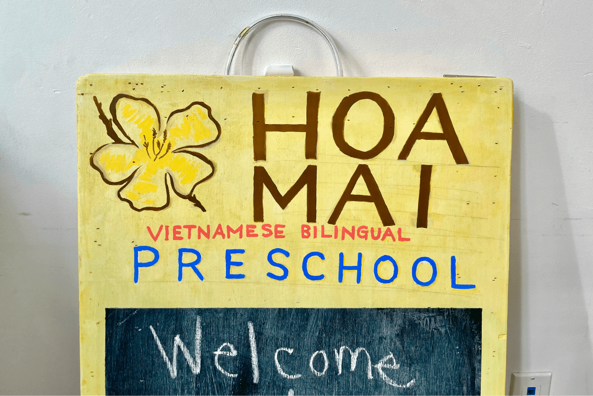
As Hoa Mai strives to create classroom environments reminiscent of home, families should feel a strong sense of belonging and experience affirmation of their identities and cultural ways of being.

Most of all, Hoa Mai preschool is a nonprofit organization, and its mission is to empower the Vietnamese community to succeed while bridging, preserving, and promoting cultural heritage.

Project Goal

Goals & Metrics

After meeting with our clients and discussing both expectations and constraints, we have defined specific goals and metrics and set out the following strategic objectives:

  • Increase search-originating traffic by 10% within three months of launch.
  • Increase enrollment by 15% within a year of launch.
  • Decrease monthly “informational” per visitor by 10% immediately after launch.

Research

Learn About the Users

To assess the current website, we used 4 research methods to identify existing issues, pain points, and user goals.

  • Usage data analysis
  • Tree Testing
  • Competitive Analysis
  • Heuristic Evaluation

Usage data analysis

Understand high-level visitor demographics and how they’re currently using the site.

Findings:
  • Key pages are identified, and finding application information is one of the most important flows on the site.
  • The site has a large segment of international visitors, mainly from China and Vietnam.
  • High traffic to the Seattle Preschool Program page, and a surprisingly high number of visitors click the address link.
  • A video describing the preschool received a significant number of clicks in spite of being embedded within a post.

Tree Testing

Identify the current navigation issues and explore how we might improve the sitemap.

Findings:
  • Too many navigation categories makes the site overwhelming.
  • Naming of some categories is confusing.
  • The order of the navigation bar categories seemed to be unorganized.
  • The side widget navigation bar takes the focus away from the main navigation bar.

Competitive Analysis

Analyze similar websites to identify key issues and distinguishing their similarities and differences.

Findings:
By studying other preschool websites, we noticed that Hoa Mai's site navigation is not well-mapped, and we referenced other websites as a blueprint to best showcase Hoa Mai's program curriculum with easy navigation.

Heuristic Evaluation

Get insight into the website's overall experience, where it has strengths, and where it falls short.

Findings:
Overall, the website lack of visual hierarchy & has confusing navigation.
Some pages has unnecessary Ads for a nonprofit organization.
Many main pages are text heavy and are information overload.

Research conclusion

Painpoints

  • The navigation system (a top navigation + a side navigation widget) is confusing, making it hard to find information.
  • The website contents are text heavy, lacking hierarchy and clarity, and oftentimes out-of-date.
  • The visual design of the current website is un-engaging, and the branding does not represent the community of Hoa Mai and its cultural heritage.

Design Process

User Personas

Based on the user research we defined 3 main user groups that uses the websites and I was able to build the user personas. I then referred to them throughout the entire website design process. The three key user groups are:

  • Perspective parents who are looking to enroll their child.
  • Jobseekers who are looking to become a teacher or staff at Hoa Mai.
  • Donors who are interested learn more about the school and make donations.

Task Matrix

Based on the user personas, we then were able to define the key actions and create the task matrix for each user group.

Design Challenges

1. Create new informational architecture and clear navigation.
2. Identify and clearly presenting key preschool information.
3. Provide consistent page layouts and branding evokes trustworthiness

Card Sorting Exercise

To address the first design challenge about creating a clearer navigation. We designed a card sorting exercise and had 11 users participated. At the end, a total of 9 navigation clusters were created.  

Navigation Clusters:
  • Career, Volunteer, Employment
  • Donate, Donation
  • Overview (Home)
  • Application Process, Apply, Enrollment
  • Facilities, Meal
  • News, Current Students & Families, Media
  • Academics, Curriculum, Learning
  • Contact Information, Location, Transportation

Information Architecture

Based on the card sorting exercise results, a new website information architecture was created.

Wireframe & Prototype

To address the second design challenge about identifying and clearly presenting key information, I sketched and created wireframes of all the website pages and handed over to our developer to build a mid-fidelity prototype.

Iteration

Usability Testing

With the mid-fidelity prototype,I went to Hoa Mai with two of my team members to run the usability testings and gained some useful insights.

About the usability testing interviews:
  • 15 questions - 3 Pre-Test questions, 10 Task-Scenarios, and 2 Post-Test questions
  • 5 participants - Parents that sent kids to Hoa Mai
  • 45 task completed

Key Testing Results

Taking a Hoa Mai “tour” was very important to the families, but the “tour CTA isn’t always available”, and it takes “multiple steps for the tour”.
Tuition being an important factor in researching preschools but Hoa Mai previously didn’t share the cost of Tuition.
Participants complimented the content layout and navigation, and they found it was easy to locate different preschool information.

branding

Brand Tenants

To address the third design challenge about providing consistent page layouts and a welcoming & trustworthy branding, I defined 4 brand tenants to guide my visual design for the website.

01

Excited

Colors, fonts, and images are energetic, lively, and vibrant to make a strong connection when engaging with the families and the community.

02

Quality

Well organized information architecture and a user-friendly digital experience that brings forth an understanding of Hoa Mai’s mission and value for high strong outcomes.

03

Historic

The images, graphics, and story embody the learning and experience of Vietnamese culture and history.

04

Committed

The brand voice, language, messaging, and content show trust and dedication to the families. Clean navigation and page layouts that are intuitive for users to meet their needs.

Typography

I selected fonts that have a smooth structure. Work Sans makes the content readable, and Nunito provides a feeling of warmth. I also made sure both fonts support Vietnamese language because the website dose have a large international audience from China and Vietnam.

Style Guide

I also made a design style guide includes all the color selections, logo and the different image ratios so that they could be developed by engineers and reused by future designers.

Final Design

New Vs. Old

I selected a few pages to show the details of the design changes.

All Other Pages

Here are an overview of the rest of the website pages:

conclusion

Reflections

  • Understanding a complex application process and eligibility requirements
  • Spending more time with the client walking through the prototype
  • Making the new website as maintainable as possible for a busy team
  • Accommodating an international, multilingual audience

solution

Native app for monitoring and supervision during the date

Onboarding

After the user has seen the various uses that can benefit her in the use of our product we will ask her to identify as a woman to protect the purity of the product and to raise in her a sense of security.

Background Check

To motivate the user to use the app, we will lead her to run a background check on one of the guys she is communicating with. Checking the background can empower the value we offer - a sense of security and control - knowledge is power.

Date Entry

While entering the date data the app gathers all the information needed to provide the user with the protection she needs. The step will be broken down into several steps to reduce the effort required from the user which will also help to focus her at every step.

During the Date

During the date, the app will send alerts according to the settings we set on the "date entry".

Reporting

To collect information that will be useful to our users, at the end of each date the user will be asked to report the date. We will make sure at this point to lower her concerns by security stamp and noting the fact that the information she is providing remains confidential.